ShopDreamUp AI ArtDreamUp

Deviation Actions


Description
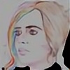
Here's the updated (and final) version of the Tarantino parody sketch I uploaded yesterday. Far better looking with smidgen of color if I do say so myself.
For comparison, here's the original: www.google.com.au/search?q=pul…
For those that don't know I'm working on a project while waiting for lit-agents, just to cool down a little. I'm calling the collection "_gets Dead-Ended" and the content is based around classic movie covers parodied by a number of my OC's in order to share them with the world a little more through humor and common interest.
I'm currently working on a second cover-parody involving a famous Kubric film, it's ridiculous and I love it.
Stay tuned.
Image size
1710x2360px 1.95 MB
© 2016 - 2024 DeadEndSeries
Comments13
Join the community to add your comment. Already a deviant? Log In
Hey Mel. I am commenting on behalf of 
Your drawing attracted my eye because of the parody, it is spot on. I knew I had recognized the image from somewhere but wasn't 100 percent sure until I saw the larger version. The young woman you have drawn here is an excellent parody of Mia although quite different in style. Mia looked like a bit of a "bad" girl, your young woman looks more down to earth, girl next store kind of quality. She is very well drawn with some good shading in her legs to give her some depth. I am also impressed with your foreshortening of her arms and left hand. You definitely have drawn it correctly. Any slip there and it would have thrown the drawing off I believe. I know she is on a bed but I think a little more shading coming off all the objects on the bed may have given the bed a softer feeling.
The one thing I cannot make heads or tails of is the image to the right (as you look at the drawing) of the title. With the young woman's feet stuck right in the middle of the image whatever it is supposed to be seems to get lost. Maybe a finer outline and less detail. Simplify the image. Also, the word "Universe" under the title seems to be a completely different style of writing than the title. I think a little continuity would have given a cleaner appearance.
Overall your parody is very well done. Is she editing a screenplay or writing one?
Have a wonderful day. (Smile)")
Your drawing attracted my eye because of the parody, it is spot on. I knew I had recognized the image from somewhere but wasn't 100 percent sure until I saw the larger version. The young woman you have drawn here is an excellent parody of Mia although quite different in style. Mia looked like a bit of a "bad" girl, your young woman looks more down to earth, girl next store kind of quality. She is very well drawn with some good shading in her legs to give her some depth. I am also impressed with your foreshortening of her arms and left hand. You definitely have drawn it correctly. Any slip there and it would have thrown the drawing off I believe. I know she is on a bed but I think a little more shading coming off all the objects on the bed may have given the bed a softer feeling.
The one thing I cannot make heads or tails of is the image to the right (as you look at the drawing) of the title. With the young woman's feet stuck right in the middle of the image whatever it is supposed to be seems to get lost. Maybe a finer outline and less detail. Simplify the image. Also, the word "Universe" under the title seems to be a completely different style of writing than the title. I think a little continuity would have given a cleaner appearance.
Overall your parody is very well done. Is she editing a screenplay or writing one?
Have a wonderful day.